Monday, 30 May 2016

BATTLE OF JUTLAND

We are in the middle of a series of 100th anniversaries of significant events from the First World War.

This weekend saw commemorations for the inhumane savagery that took place at Verdun in France, and July 1st sees the centenary of the start of the Battle of the Somme. 

The next 2 days is the anniversary of the war's only major sea battle, the Battle of Jutland. Fought on May 31st - June 1st 1916, the vast juggernauts of the British and German navies met off the coast of Denmark. It proved to be a rather inconclusive affair, but probably proved that neither side could ever hope to totally defeat each other navies.

The most famous part of it all however, was the story of the Victoria Cross winner, Jack Cornwell. The 16-year-old, who stood by his post when all were lost around him. The gun he was still protecting when he was found dead is now in the Imperial War Museum.

My own Grandfather was serving in the navy at the time, having signed up for a 15-year stint in 1914, just before war was declared. He was stationed in Scotland at the time, and so would more than likely either have been there or on the fringes of the battle. Apparently he did speak of it, although sadly I never met him to ask about it.

I've got two interesting items to show you from the battle, first is a commemorative medal made in 1916 by Spink & Son. They were sold to raise money for naval orphanages.


And a very rare original photograph taken from H.M.S. Nottingham at 5pm on May 31st 1916. I bought it at an antiques fair in the Midlands some 20 years ago, and have treasured it ever since.


Saturday, 28 May 2016

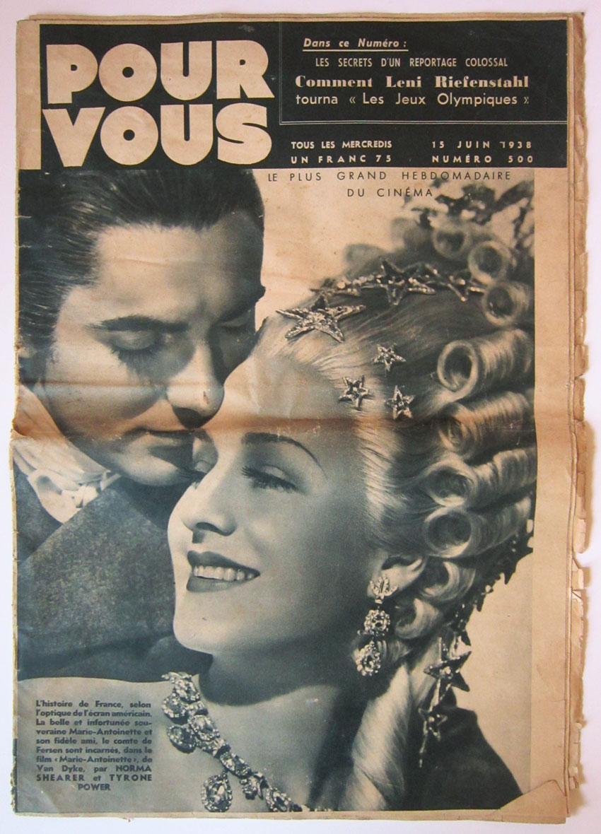
POUR VOUS MAGAZINE

At the recent Ally Pally antique fair I picked  up some amazing magazines....

These outrageous deliciously Deco French cinema gems called POUR VOUS.
Translating to 'For You', I'm afraid they are going to be all for me, as I love them too much!!!

They all date to the late 1930s and have fabulous front covers that absolutely scream Art Deco style! 
With a gorgeous logo, huge and beautiful photographs of stars of the day, and a clever use of type that doesn't clutter up or get in the way of the stunning photos.

They are bold and innovative, as many of the magazines of the time were. 
Check them out here...


I've only quickly photographed them to show you, but I've recently just raided the ArtPix coffers to buy an all new A3 scanner! I'll be able to scan these in properly, as they are all A3 size, and maybe do some nice prints and frame them up. Let me know if you are interested!!

Thursday, 19 May 2016

F.A. CUP FINAL FEVER!

This Saturday is the F.A. Cup Final, the 135th time teams will compete for the famous old trophy.

The media like to insist it has lost all its glamour, but try telling that to the fans as they trudge up Wembley Way!

This year sees Crystal Palace take on Manchester United. The football world could see another epic shock if Palace can do a Leicester and run off with the cup.

It would finish off a mad season if the Eagles can do it, and would be especially fitting, as they've never won the trophy in their 111 year history. Man U on the other hand have lifted it 11 times.

And lucky you, both teams feature in my RETRO FOOTBALL series! 
So before you settle down to watch the final, have a peep at these icon packed collages and see who you recognise!


CRYSTAL PALACE


MANCHESTER UNITED


Wednesday, 11 May 2016

NEW STOCK!

This weekend I'll be back at my unit at The Customs House in West Bay to bung some new goodies in there!

Have been busy preparing things this week and have realised I've got some much stuff, that it won't all fit in! So I'll have to leave some of it behind, but fortunately sales have been brisk, so there should be enough space in there soon.

Get a sneak preview here of what I'll be putting in there...

A gorgeous 1960s Midwinter Coffee Pot, the Spanish Garden motif was designed by Jessie Tait.

A Susie Cooper cup and saucer!

The Bartholomew's Maps from the 1930s to the 1950s, that I've blogged about before.

Here is a new RETRO FOOTBALL idea, an exciting package of Retro Tottenham Hotspur programmes. Alongside my Retro Football Packages, they make a fantastic pressie or souvenir for any Spurs fan.


The picture below shows a work in progress! Another new venture, where I've used original vintage playing cards. The cards are of the iconic children's TV programme MUFFIN THE MULE, from a card game made in 1949. They can be sent as a unique birthday card or kept as a memento.


Find all these at The Customs House in West Bay, in my unit on the 1st Floor of the main building.

Monday, 2 May 2016

VINTAGE MAPS

Have been plundering the ArtPix Archives for new stock to put in my unit at The Customs House...

And found my amazing collection of vintage maps!!


They are all classic Bartholomew's Revised 'Half-Inch' Contoured Maps dating from the 1930s to the 1950s. Printed on exquisite cloth, many of them are in mint condition.

Fabulous stash of beautiful Bartholomew's Maps!

North Lancashire and Isle of Man map from 1934.

This map of South Wales has the date January 1947.

A map from 1957 of Warwickshire.

The English Lakes unusually has a different coloured cover. It dates from 1937.


So next time I'm down in Dorset's West Bay, I'll be dropping them off at the unit. If you can't wait that long, no problem, as there are already a number of fantastic vintage maps in there. Go and check them out now!!

Brand new sign I've done for the box of maps I'll be putting in the unit!


Sunday, 24 April 2016

THE SNOW GOOSE by PAUL GALLICO

This classic book was first published in book form in 1941, and none of its powerful symbolism has been lost over time.


It's a simple tale of an artist who, tired of the world and his disabilities, has retreated to a solitary life in the wild marshes of Essex. He paints the landscapes and the migrating birds there and feels very much at home.

His life changes when a local girl appears with an injured bird, wounded by gunshot from nearby hunters. The snow goose becomes part of both their lives and so starts a heartbreaking but beautiful story.

At only 64 pages, the book is a very short read, but is absolutely packed with emotion. It also effortlessly captures the dramatic and unique landscapes of that particular part of Essex's coastline, using the minimum of words.

I've read that the inspiration for the location and nearby village was Bradwell, and knowing it very well, I can easily picture the sounds and feel of the fictional Chelmbury and Wickaeldroth spoken about in the book.

It was written in the aftermath of Dunkirk in 1940, and so the messages of friendship and the symbolism of the snow goose were especially poignant. It also hints at an England that was being lost forever. The timeless trades of the people who worked the waters in the area were fading away, and also the local dialects that were in their last throes.

Taking a look at my own copy, and despite its battered dust jacket, is a design triumph!
The subtle line-drawing of the goose on the opening title page is gorgeous, as is the subtle use of blue colour type for the title and author. The blue is continued throughout the book, with the headers at the top of the page, that have another brilliant little touch, the blue silhouette of the goose.


It was printed on Antique Wove paper, and has a lovely grainy texture. All this is quite something, when you consider my copy was printed in 1942, when paper shortages and restrictions on usage were in force.


Another little detail is an intriguing inscription that has been written inside. 

To Amy,
A small recompense for my airgraph omission!
With best love
from D.


An 'airgraph' was a extraordinary invention. Also known as a V-Mail (Victory Mail), it was basically a way of saving money on sending letters overseas through the military postal system during the last war. The ingenious method involved writing your message on a form, which would be photographed and stored on microfilm then sent abroad by plane. Once it got to its destination, the message would be printed onto photographic paper, for the recipient to read. WOW!!!

So I wonder what 'D' had forgotten to write on their airgraph message to Amy??!
And I hope she enjoyed reading her copy of The Snow Goose!


Sunday, 17 April 2016

SHEET MUSIC TYPOGRAPHY

Recently I rescued a forlorn looking pile of sheet music, unceremoniously dumped in a plastic bag at a boot fair.

In amongst the huge stash were some lovely examples of late Victorian and early Edwardian sheets.

They get a bit left behind by collectors, due to the later ones having exquisite colour illustrations and photographs, especially in the 1930s.

But to anyone who loves typography, these are absolute gems!
They all have beautifully crafted and bold lettering, that just screams late 19th Century and early 20th Century style. 


Gorgeous typography on The Arcadians from 1909.


The collection seems to have belonged to the same person, as most have the name E. Raike scribbled in the top right hand corner. It's lovely to think this person trooped around, who knows where, clutching these music sheets and playing in a concert hall, a village hall or someone's house. They were obviously well-used and well-loved as they have thumb prints in the corners, through continually turning the pages, and one has been sewn back together!


 The mysterious E. Raike, who seems to have been a prolific player!


Here are just some of them here for you to see...


Jessie's Dream has certainly had an eventful life! It's the oldest in the collection and dates to around 1888. Love the way it has been stitched back together. 

 En Route Quick March from ©1890

 1917's The Maid of the Mountains.

 The designer had fun on the typography here!

 Nice border designs, looking a bit Art Deco, although it dates from much earlier.

 The Liberty Bell March from 1893.

A rare splash of colour on this one! Dates from 1901.

 Subtle but effective lettering on this bashed music sheet.

Lovely purple tint and flower designs on this 1890s A Summer Holiday.

 Love the intricate motifs around the G.

 1902's Down the Vale song is a bit bashed, but you can still see the different fonts used to great effect.

 Complicated 1890s type for the wonderfully named Charles Kinkel.